
Head of Operations
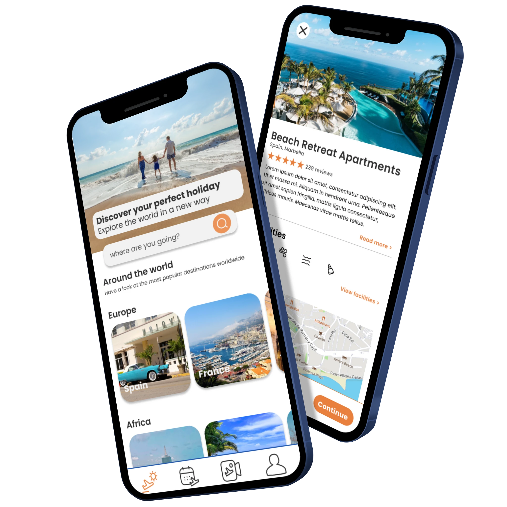
I took on the challenge of redesigning Travel Republic's mobile application, focusing on the home page, and user flow for viewing search results. This resulted in a modernised and refreshing app experience which increased user satisfaction. With almost half of all travel plans booked through apps, ensuring a great user experience that is up to date with industry standards is important to stay competitive and also stand out in an industry with high supply and low demand.
I went through the design process, stopping at the design stage.
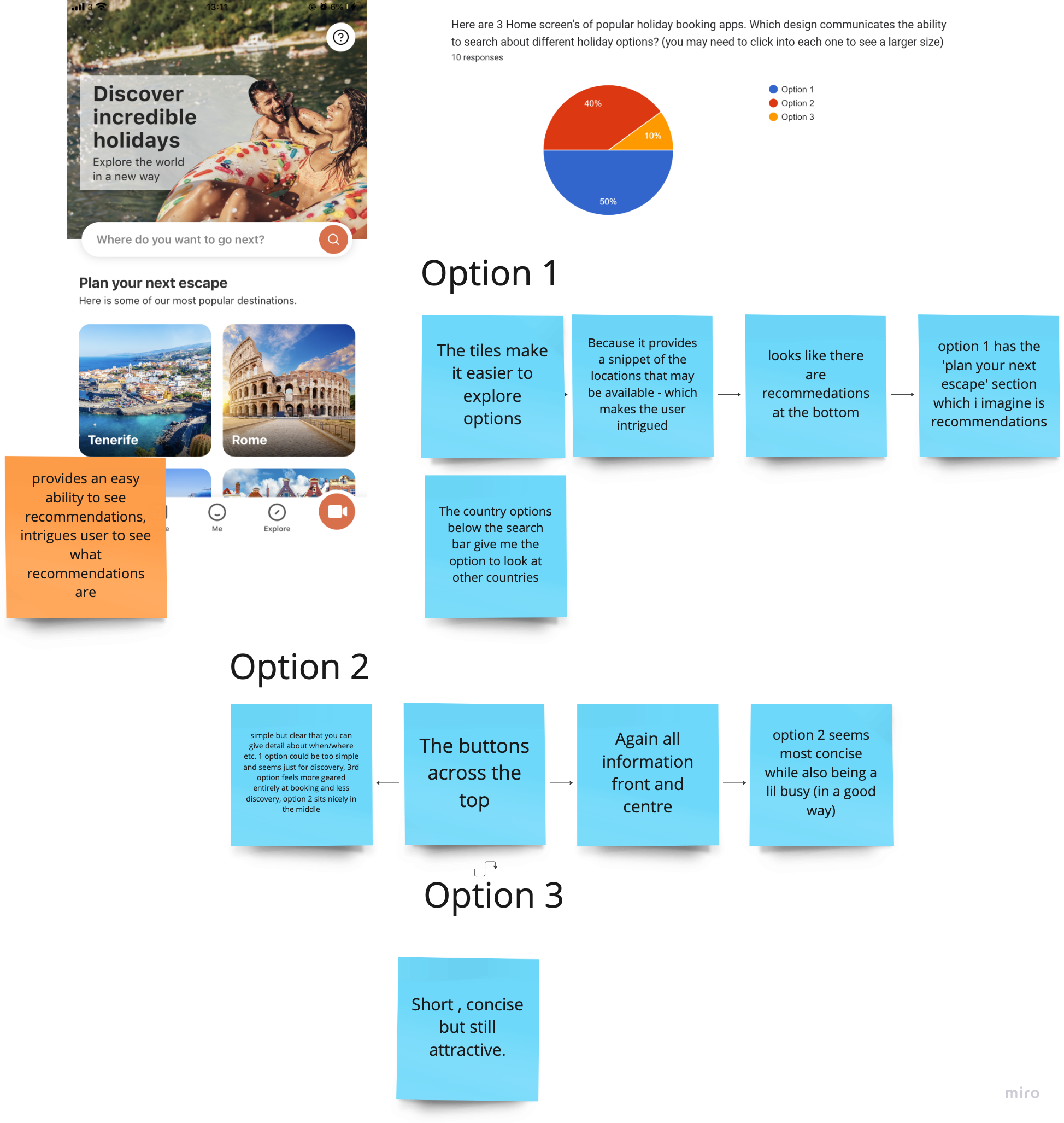
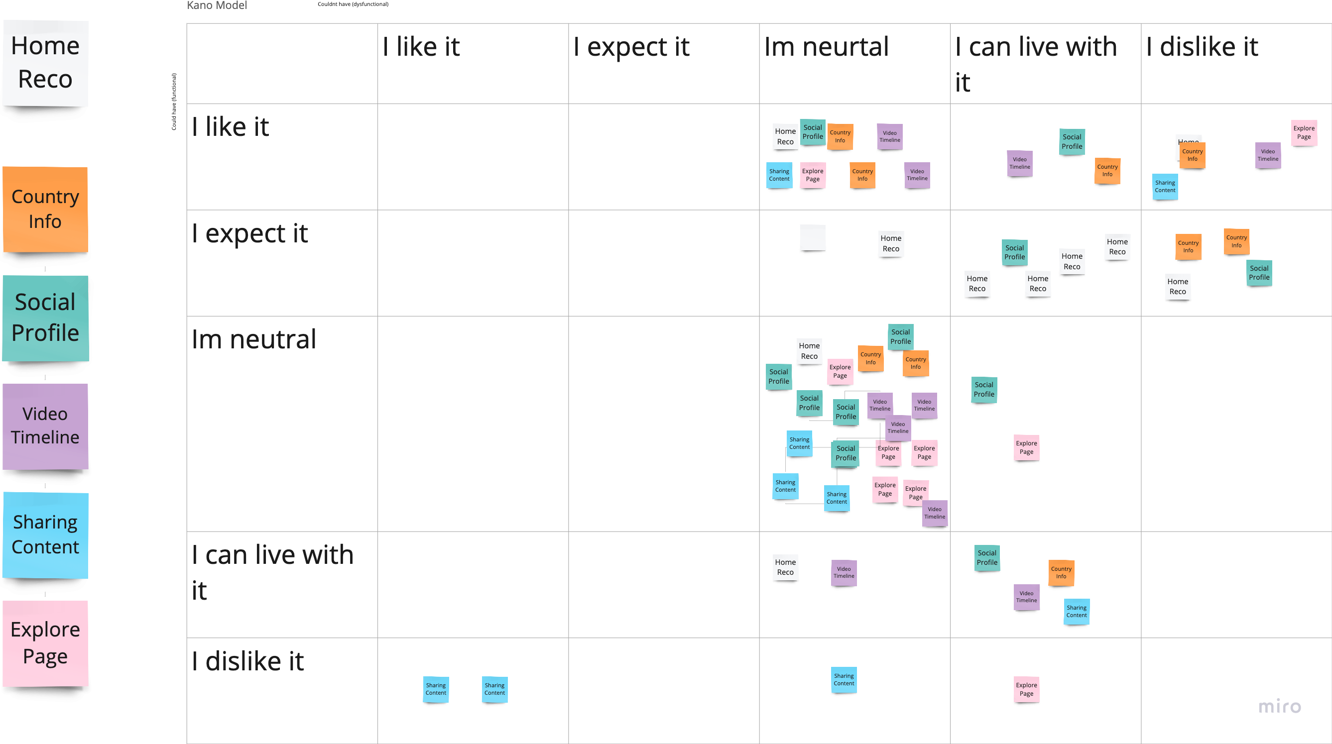
I created a user survey which compared competitor screens to Travel Republic, and created a Kano Model to scale the appetite for new features
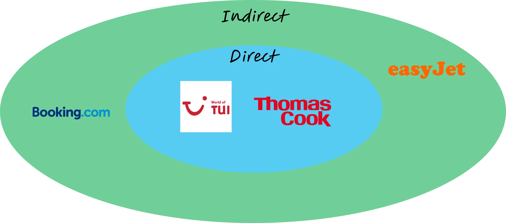
I chose 4 direct and indirect competitors to Travel Republic. Of these I chose the 2 direct competitors to compare their screens with Travel Republic's.
Competitive Analysis
The survey allowed me to gain the insight that participants thought competitors screens. The insights from the qualitative and quantitative survery were that competitors ui design:
Prototype
Using a Kano Model, I was able to see user appetite for new features. The survey data on preferred features gave me enough data to create a Kano Model,
Kano Model
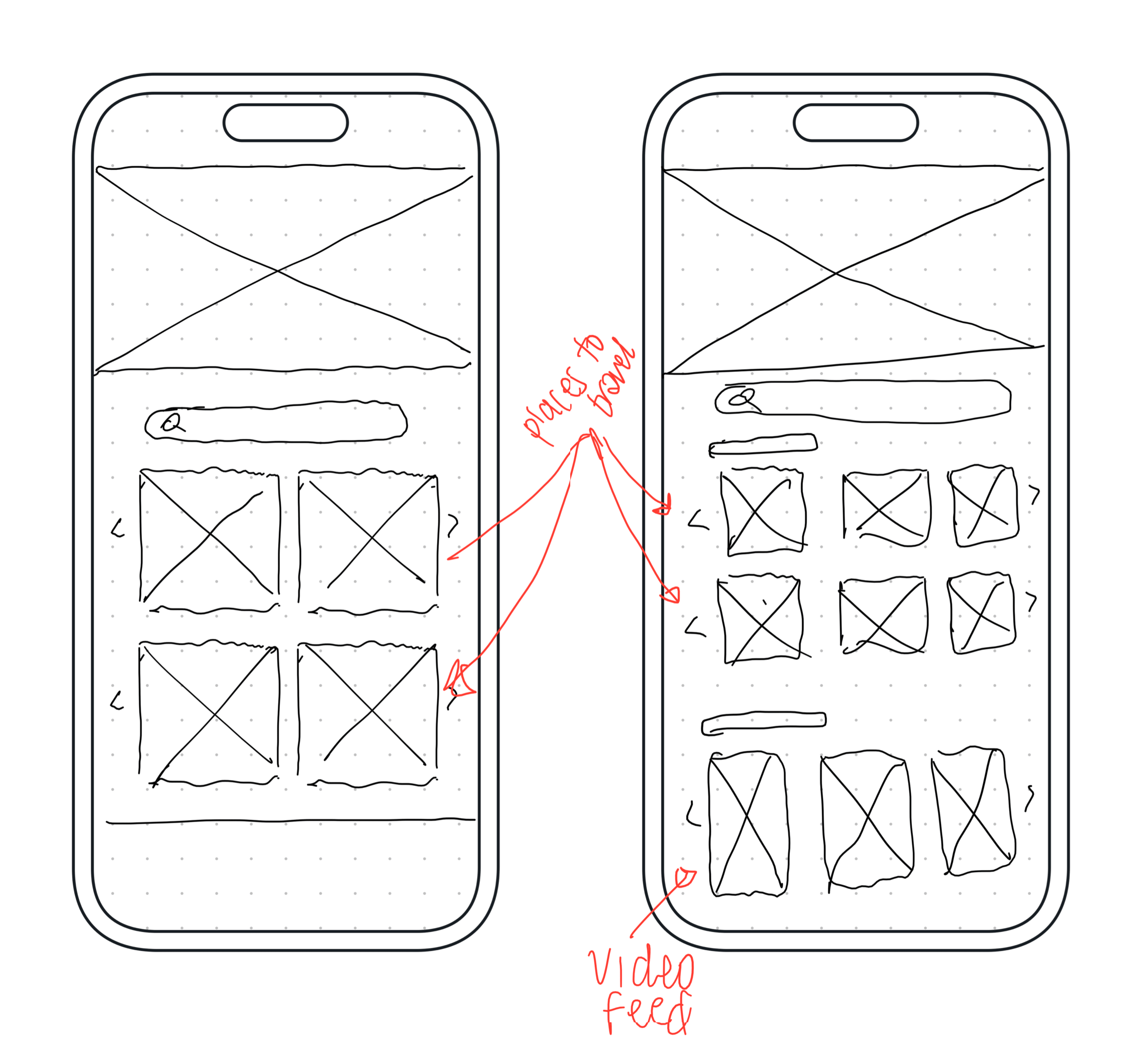
I sketched out UI's with improving the layout, focusing on the home screen to booking flow.
Home Page Sketch
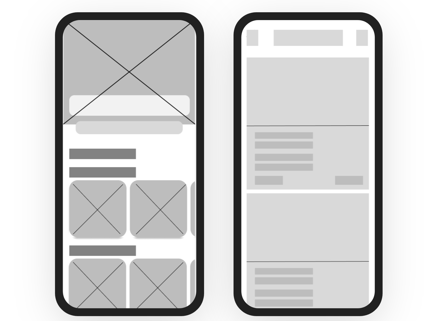
Turning my sketches into low fidelity wireframes gave me the opportunity to stay in line with the research insights of a clear and non distracting layout.
Low Fidelity Wireframes
You can write here as much as you want, this text will always look nice, whether you write longer paragraphs or just a few words. Click here and try it out.
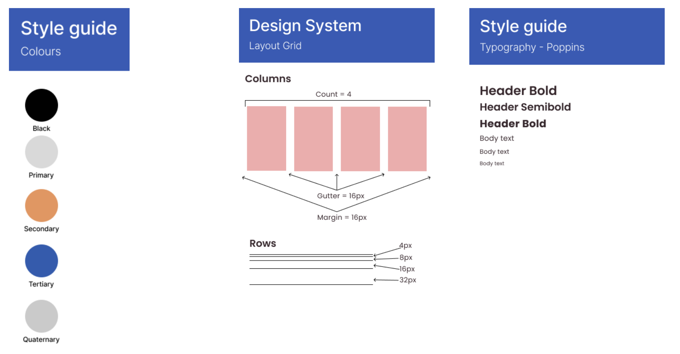
Design System
I drastically changed the homescreen by including recommendations for users to pick from as soon as they open the application. Relating to the research, I inlcuded a video feed for users to scroll through so they could see where other users travelled to, reinforcing the recommendations element and also providing community feedback to keep users engaged in the app outside of booking a holiday.
Home Screen Before and After
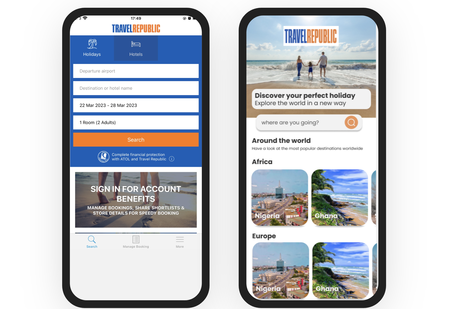
I stripped down the amount of information on the screen, improving the visual heirachy for each card
Search Page Before and After
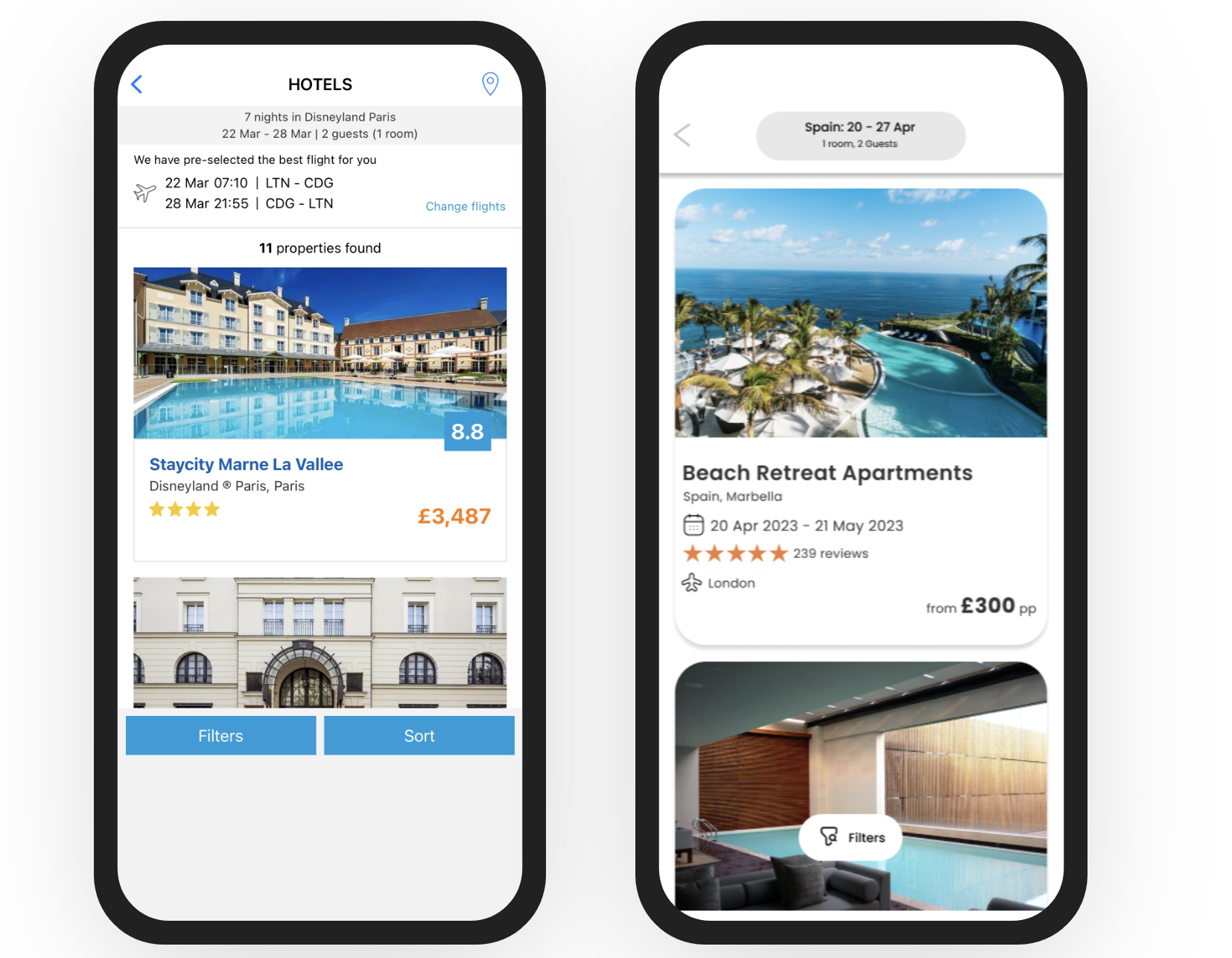
Again, focusing on improving the layout I focused on enhancing the visual heirachy of the screen, and providing a call to action when they enter the screen to increase the likelihood of purchase.
Single Result Before and After
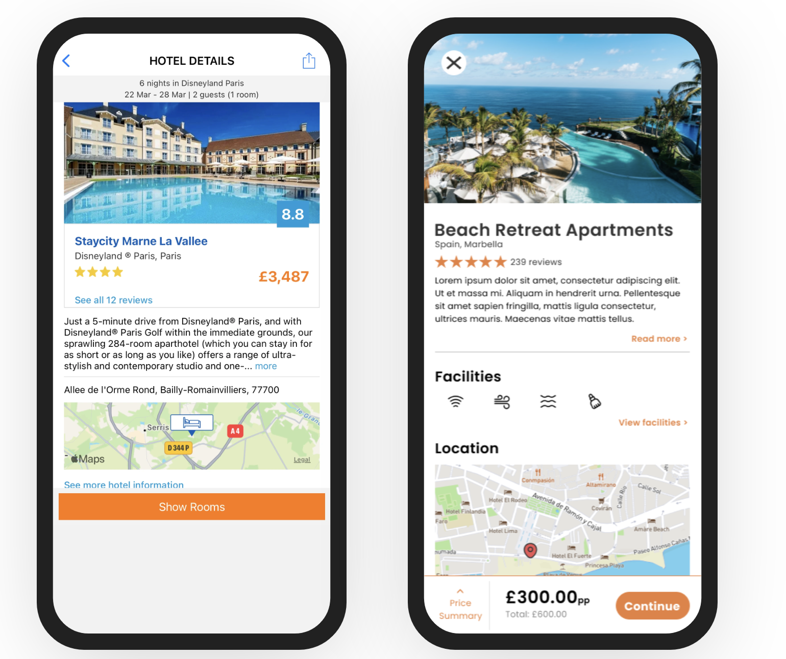
Set Realistic Expectations
First lesson learned is that in a 2 week sprint, designing 5 features is no joke! Haha. I wanted to push my design skills to the max with the project and I've come to realise that feature development takes time. 2 weeks to develop 5 features by myself was not realistic.Feature Prioritisation
Using the Kano Model I was able to understand which features users would be delighted and satisfied by. Seeing users would be delighted, satisfied and expect vs features they were indifferent about further guided my design process in staying lean and honing in on ensuring TR's mobile app provides an experience that has a bit of a wow factor.If I had more time I would…