

Head of Operations
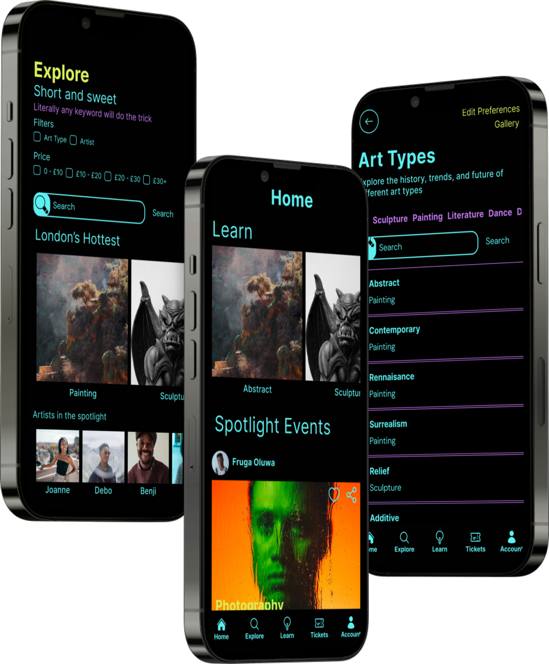
Video Case Study
I improved the usability scores and qualitative feedback of a mobile application ,created to improve accesseibility of black art in the UK, I conducted user research, gathered valuable insights, and designed key user flows to create a intuitive and efficient app experience. The result was a user-centred design that created an innovative approach to increasing exposure of underrepresented minorities.
Product Designer
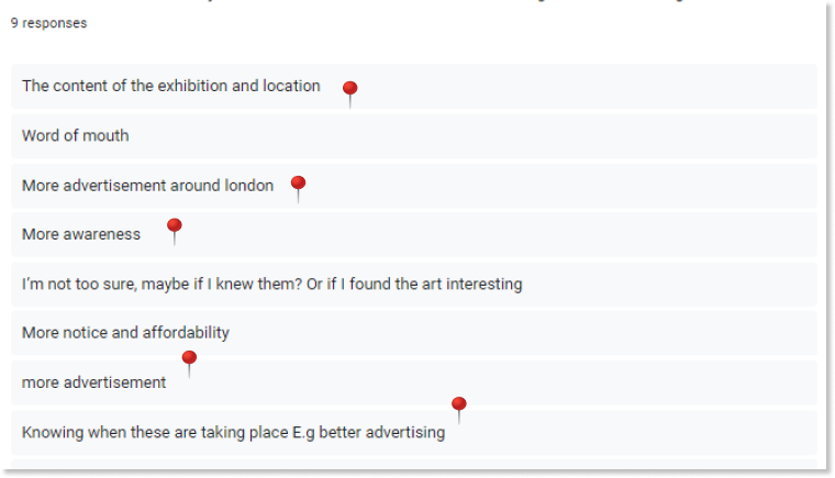
Using a topic map, I defined my research strategy and objectives. Understanding the target audience and their challenges was my first priority. Secondary research revealed black people were 20% less likely to visit an art gallery or attend an art event thank white or asian people. I built an online survey that included multiple choice and ordinal-scale and shared it in various relevant communities. In just a few days, I received 9 submissions.
Topic map
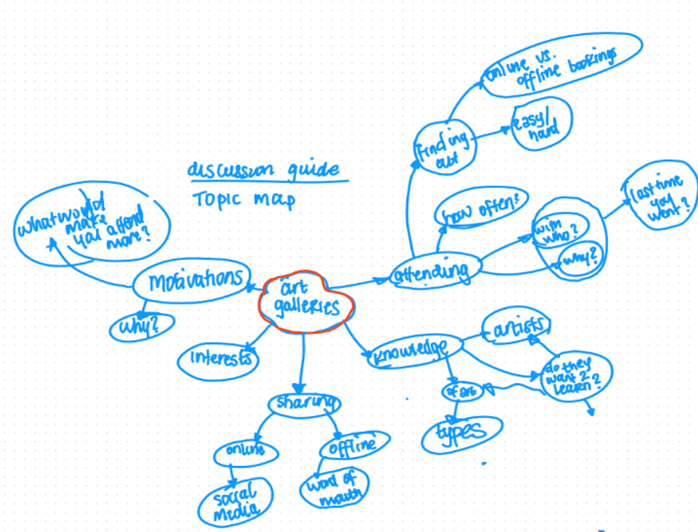
In 7 days, I recruited and interviewed 7 users remotely. I referenced the user interview findings throughout the entire design process. I built on the surveys I conducted with user interviews to create personas and to inform the design going forward. Using the topic map, I prepared an interview script with 18 open-ended questions, focusing on our target audiences’ values, motivations, and daily routines.
Survey results
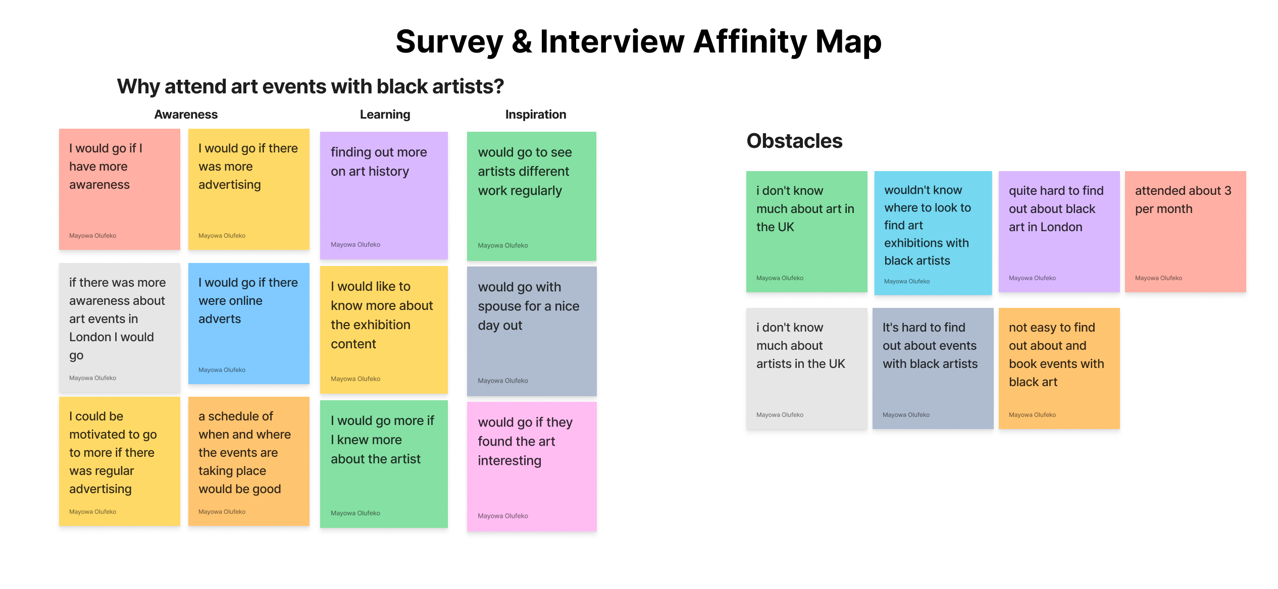
The patterns in the data easily allowed the affinity map to be divided into 2 insights - the motivation for users to attend more art events by black artists, and also what are the users obstacles to booking and attending events. The most surprising pattern I saw emerge was that users also wanted to learn about different art types as well as attend art events. The insights gathered concluded to these 4 main pain points: Users were frustrated at the lack of exposure of art events with black artists. Users had nowhere to go if they wanted to find one place which allowed. More awareness would motivate them to attend more events. Users wanted to learn more about art as well as attend art events. In the affinity mapping phase of the project, I synthesised vast amounts of data, observations, and user feedback into meaningful clusters and patterns. This approach helped us uncover critical insights and trends that informed our design decisions.
Affinity map
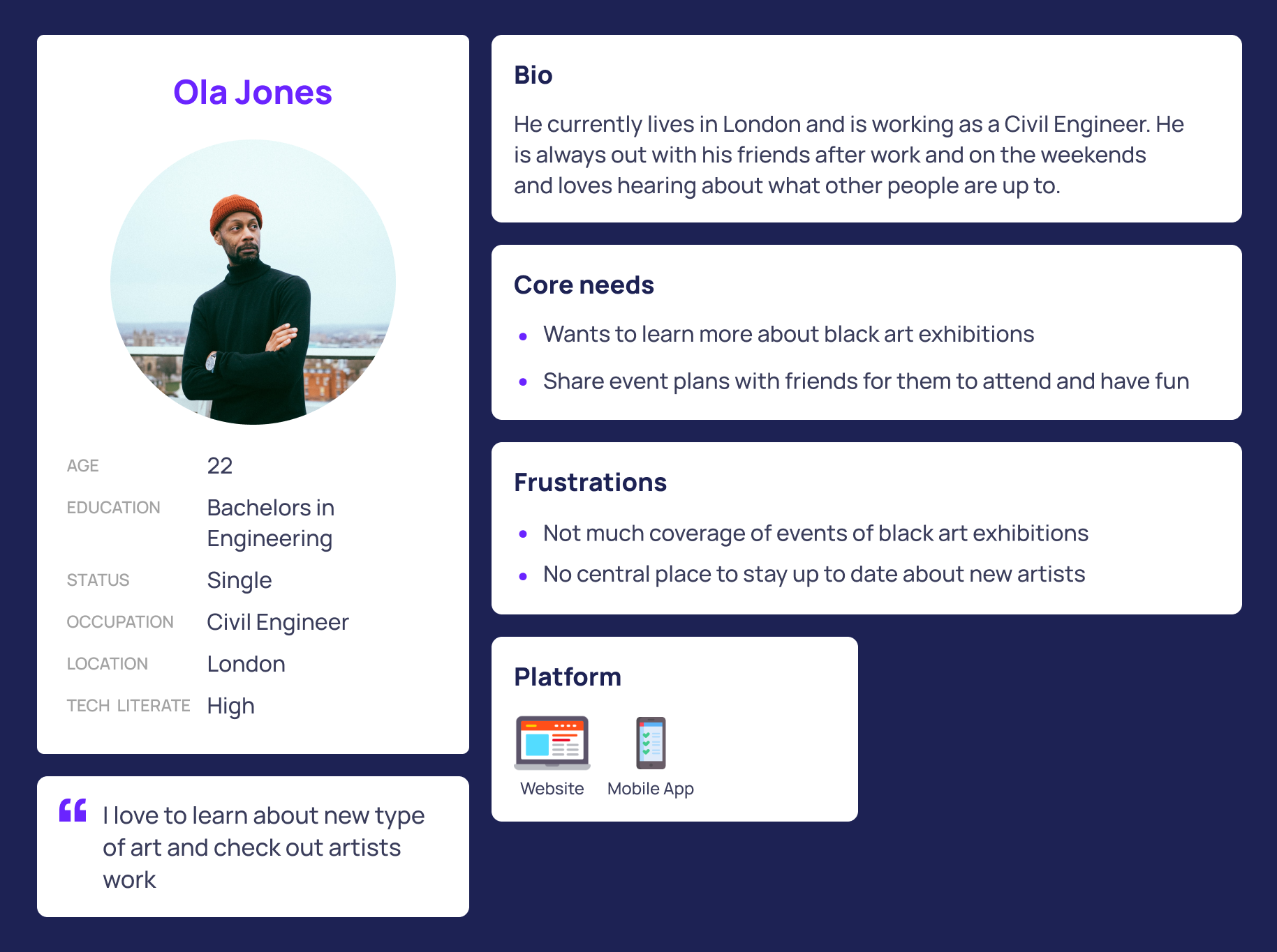
I created 2 personas for each of our user segments. They were based on user interviews and surveys, and I kept updating them throughout the project as I gathered more data. I used these personas whenever I wanted to step out of ourselves and reconsider our initial ideas. This helped me to deepen my understanding of the their needs, pain points, behaviours, goals.
User Persona
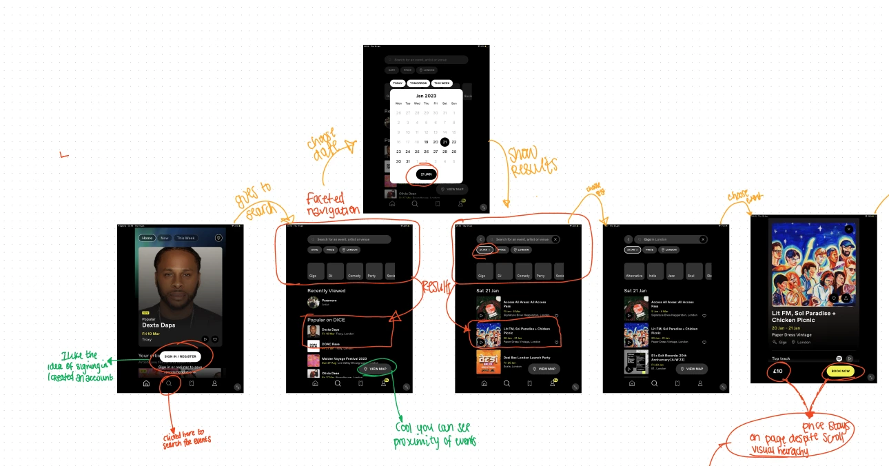
I conducted a task analysis on Dice's mobile application to gain inspiration on how to create the ticket booking user flow Dice used. I found that Dice's userflow was super simple if a user knew what they wanted to look for, with the faceted navigation helping, and also if they were up for anything then they could find choose from popular events at the time. The later gave me an idea on how making it easy for the to find and book was essential to great user experience.
Task Analysis
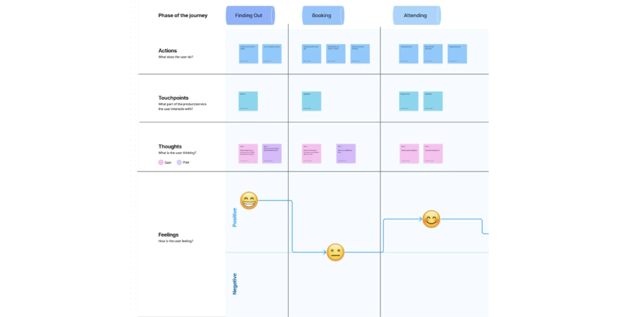
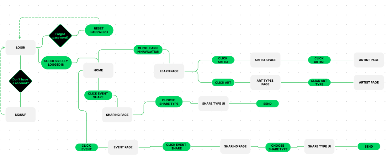
The first was providing a platform which allowed users to book and learn about art events in the UK - with users not knowing where to go and needing awareness, creating an application to solve this issue made perfect sense. Secondly, to go full circle, sharing the events, and also learn pages helped to boost awareness and increase the ecosystem of the mobile application. Because there has not been an ability to raise awareness, allowing users autonomy to share through the app is a feature that is crucial.Mapping out the user journey revealed 2 opportunities to solve the users pain points - at the start, and at the end of the experience.
User Journeies
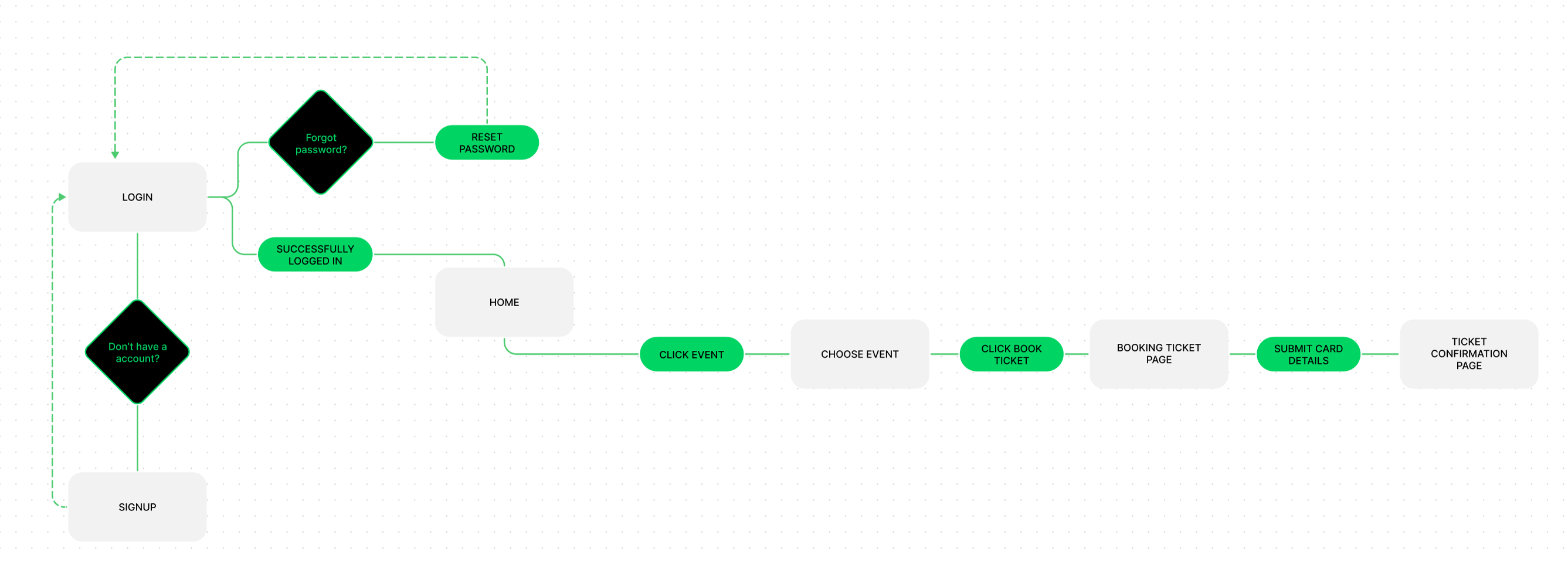
I focused on streamlining the booking and sharing features in the design process, paying particular attention to the visual layout and visual heirachy. I wanted to optimise this by reducing the number of screens needed to complete their action. Because of this I created the user flows of booking an app and also sharing to see how users would navigate the product, seeing if there were any bottlenecks or areas for improvement before designing.
Booking User Flow
Learning More User Flow
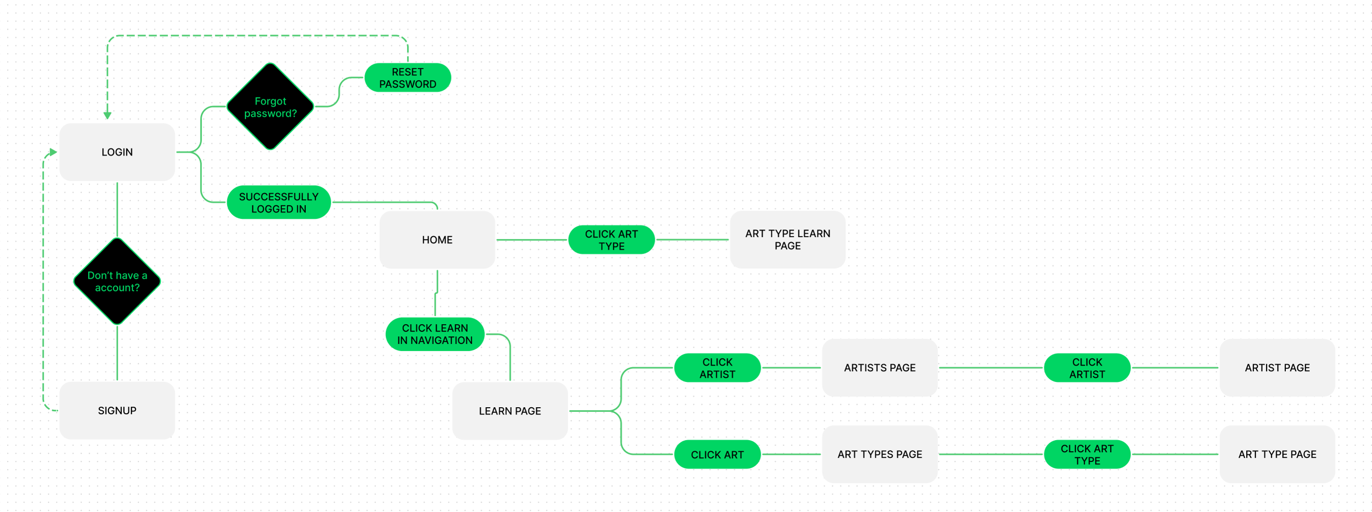
Share EVent User Flow
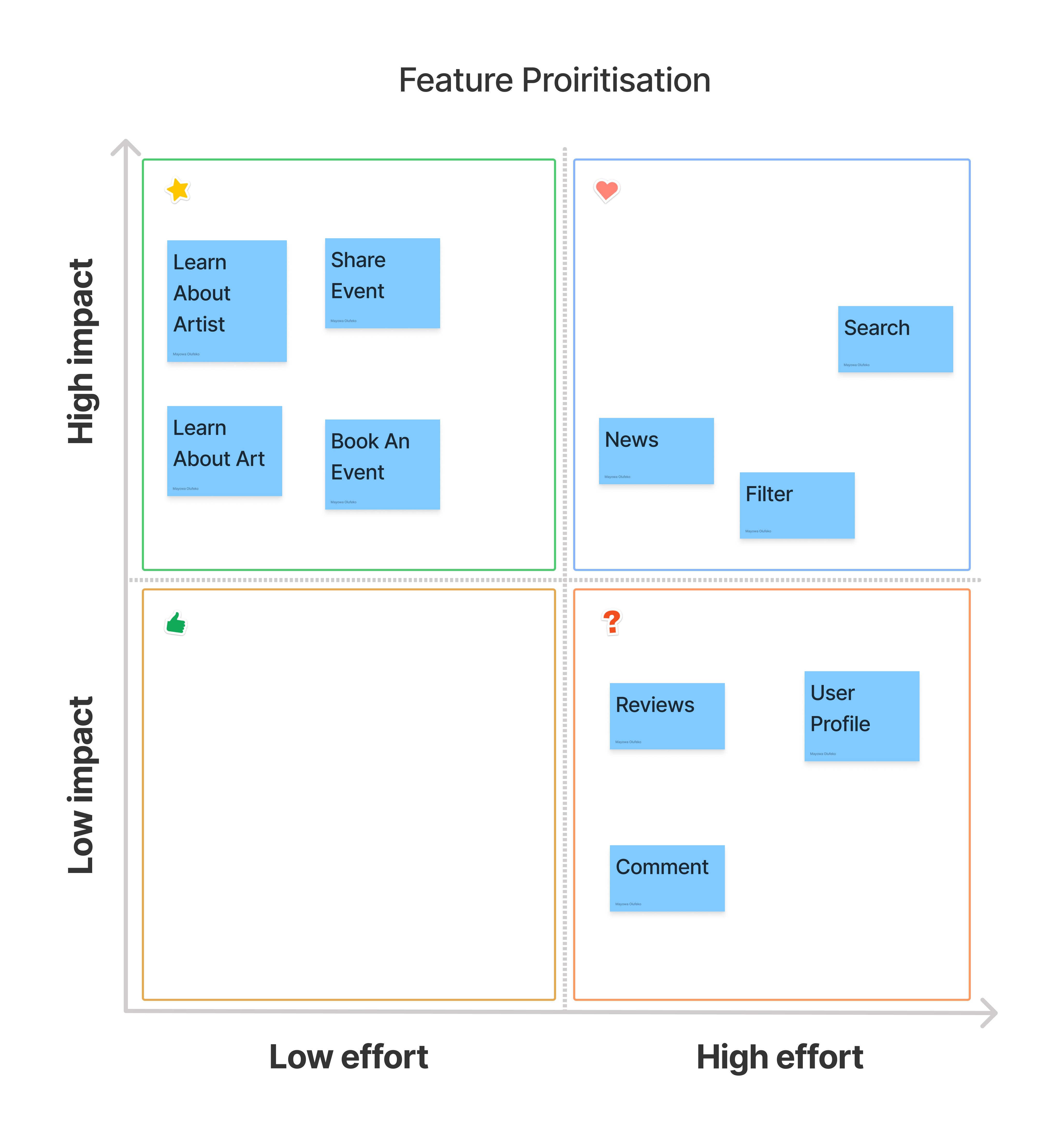
I wanted to ensure that with the features implemented focused on providing a solution for the users. I came up with the features of:
Feature Prioritisation
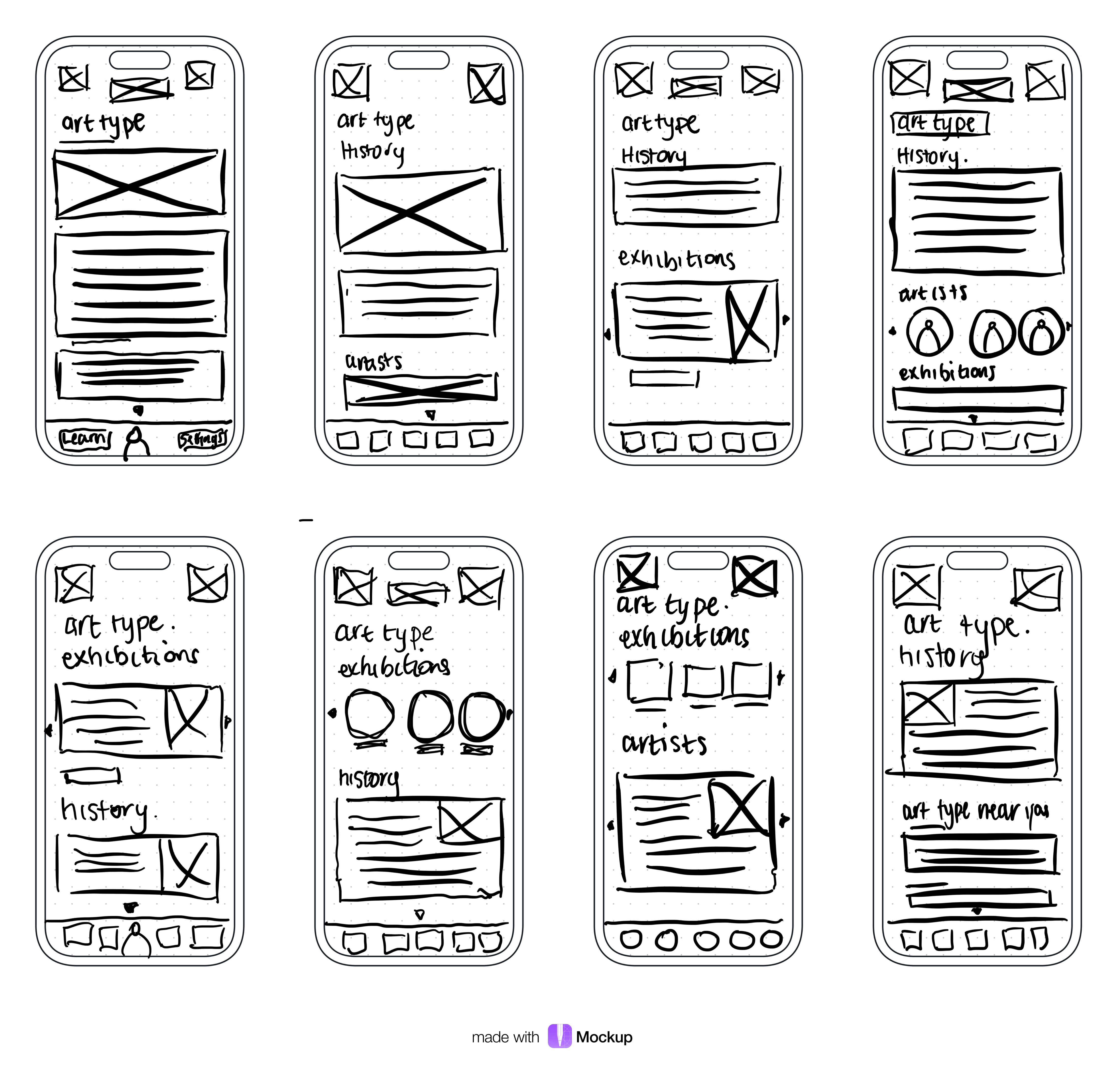
I came back to the sketches throughout the entire design process to make sure that I don’t lose sight of our primary goals and ideas. My sketches were based on the initial user interviews and surveys, as well as the user journey. They each pointed to the necessity of being able to book and learn about art events and also share them to increase awareness. I began the design process with low-fidelity sketches and wireframes to brainstorm potential ideas through crazy 8's, and to accelerate decision-making through visualisation without losing time.
Crazy 9's Sketching
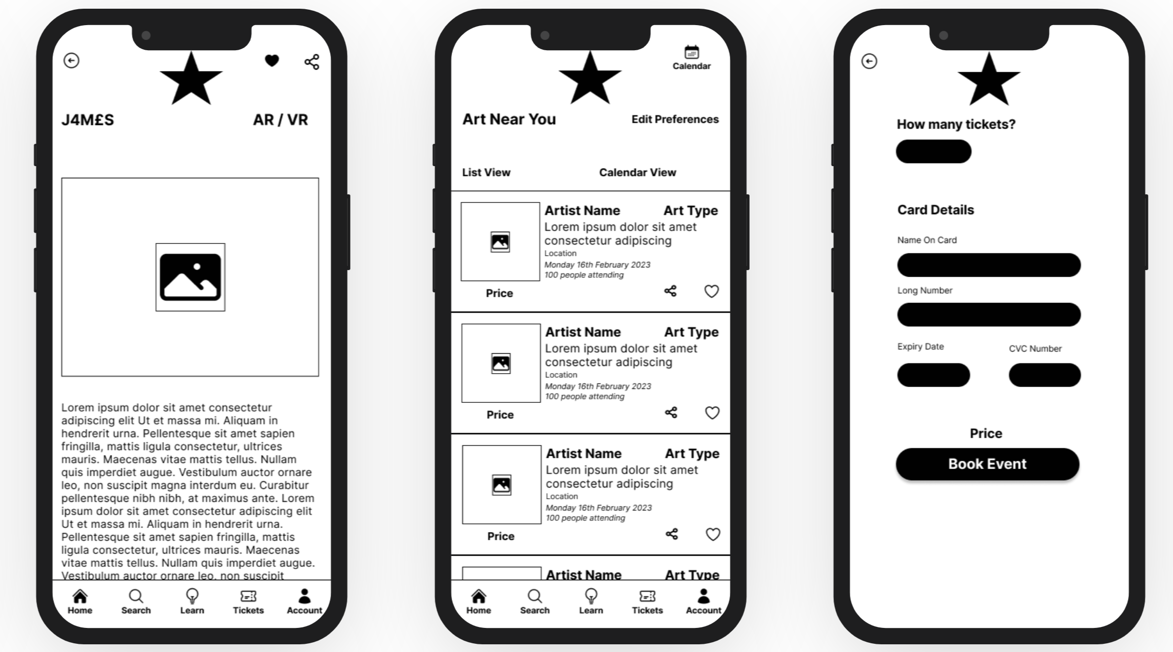
Using Figma, I translated my first sketches into low-fidelity wireframes, with the users goals and needs front of mind. At this stage, I felt confident the wireframes were defined enough to head straight into creating high fidelity prototypes for some user testing. I enjoyed seeing the userflow turned into UI screens. I kept referring the user journey through this time to make sure i was addressing the pain points whilst whilst providing an easy to use intuitive interface. For purchasing a ticket, I gave only 2 exit points, by removing the bottom navigation to provide funnelling towards the action and goal of buying a ticket.
Low Fidelity Wireframes
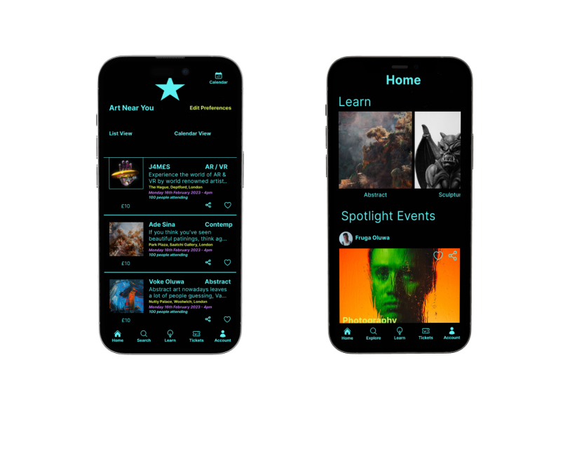
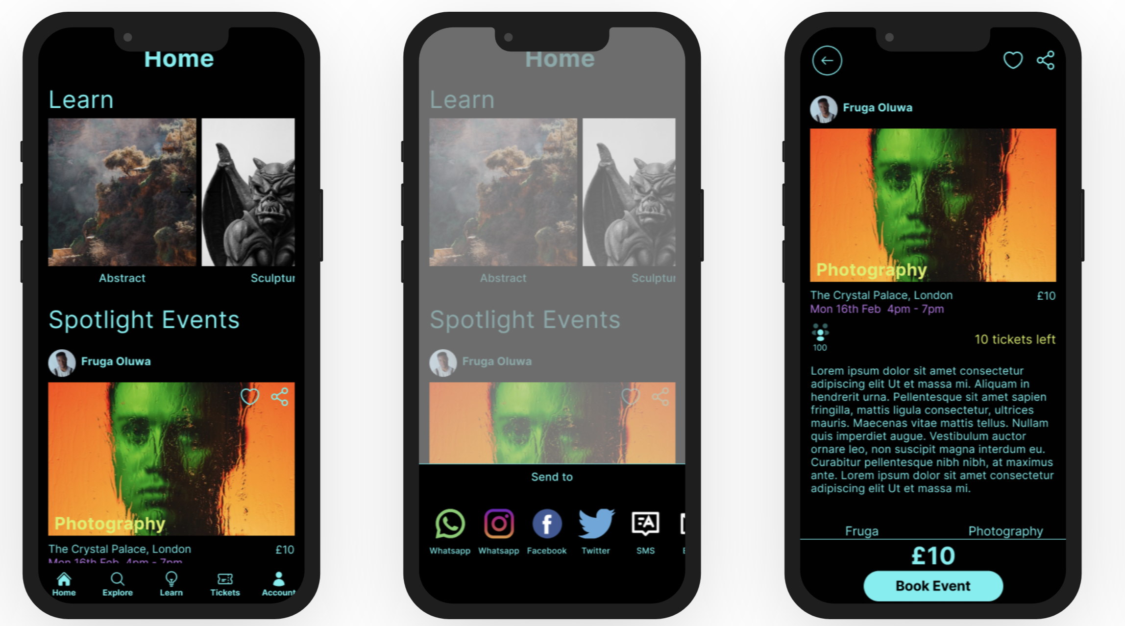
I used the usability testing feedback to improve the usability score by 40%. Using Maze, I performed 25 unmoderated usability tests looking at the 3 user flows of booking an event, learning about an art type, and sharing an event. The usability test came back with 2 main issues on the whole app, in which the home page provided the most insight.
Issue 1: High Cognitive Load
The feedback I gained was the the screens, particularly the homepage was overwhelming in terms of the amount of colours used and the amount of information on the screen. This was a prevalent theme through the qualitative feedback I received.Issue 2: Lack of Visual Heirachy
This high cognitive load was just the secondary issue. The lack of visual heirachy meant that the cognitive load issue was intensified. Watch the video below to see how I improved the qualitative feedback and quantitative score of the home screen.Home Screen Before And After
Time
If I had more time on this project, I would have worked more on the design system, fleshing out how the colours would be used more strategically to guide users to end goals. I would have also conducted moderated usability testing to balance the unmoderated testing,Resources
Being the only designer on this project meant working through the design methodology as quickly as possible to generate ideas and a solution. If I had another designer it would be possible to increase the number of features in the prototype, working through the 2 x 2 feature matrix.Learnings
This project solidified my knowledge of always utilising research data to produce insights for accurate problem solving. Seeing how the data I was able to gather turn into a solution. Having research however doesn't mean leaving the user behind. Regularly referring back to the data, and doing user testing keeps the solution honed on making sure the needs and goals of the user are catered for.Staying in the principles of design helps to improve the user experience without a doubt - utilising this during user testing helped to me to see first hand how feedback can change and improve.